

Xylo AI is a decision intelligence platform for financial advisors. It connects client data, engagement signals, and AI reasoning into a single workflow. So advisors always know who needs attention, why it matters, and how to reach out.
CONTRIBUTION
Lead Product Design
UX Research
Design System
TEAM
CEO
Design Manager
Engineers*3
TOOLS
Figma
Zeplin
Jira
TIMELINE
6 Months
Top Actions
Surfaces the most important client actions in real time, guiding advisors on who to contact, when to engage, and providing the context behind each recommendation.
Client Profile
Client Profile consolidates relationship health, DISC personality insights, CRM notes, and top actions into one place — so advisors spend less time preparing and more time connecting.
Context
Designing an AI-powered relationship intelligence system for financial advisors
In the summer of 2025, I worked at Xylo AI as a Product Design Intern, where I helped define and design the core experience of a new product aimed at improving how financial advisors manage client relationships.
The primary challenge was not the lack of data, but the overwhelming volume of fragmented signals. Advisors needed to constantly answer three key questions: Who should I reach out to? When should I act? How should I communicate?
However, these decisions were fragmented across multiple tools, requiring significant manual effort and often leading to hesitation or missed opportunities.
To address this, I reframed the product from a data dashboard into a decision-support system, and translated these core questions into a structured interaction model.
This shift transformed the product from passive data monitoring into an active system that guides decision-making and reduces cognitive load.
My Role
I led the end-to-end design of the core product experience, focusing on defining how relationship intelligence is structured and translated into actionable decisions.
I Developed the AI-assisted communication flow, enabling advisors to quickly generate and refine outreach messages
Impact
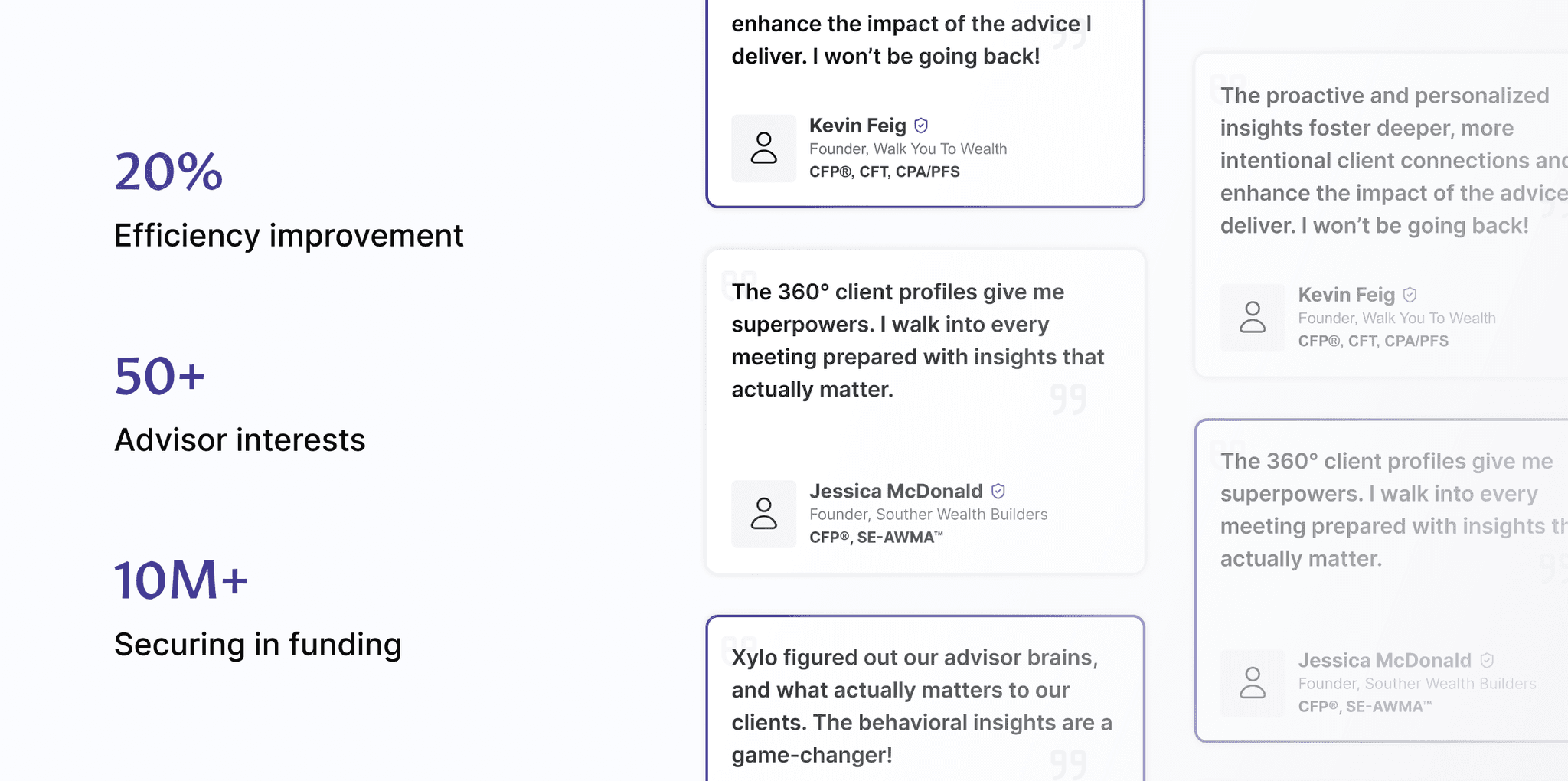
Increased advisor workflow efficiency by 20% by reducing decision hesitation and manual signal analysis.
Improved prioritization clarity, leading to higher engagement with Top Actions and proactive outreach.
“The numbers are easy. The hard part is understanding what my clients need from me at the right moment and communicating it clearly.”
— Bob, Financial Advisor
Understand
From Users: Information is abundant
but fragmented.
I conducted the user interviews with advisors, they described their workflow as mentally exhausting. They searched through emails, CRM notes, and call records to prepare for client conversations.They constantly switch between tools to answer three core questions: Who needs my attention right now? What has changed? What should I do next?


Designing a decision system, not just a dashboard
I approached this not as a dashboard redesign, but as a decision system problem. The goal: surface the right client, at the right moment, with enough context to act — without advisors having to go looking for it.

Project Goal & Scope
Translate fragmented client signals into clear, confident actions, then reduce cognitive load.

Project Task 01
From AI-generated draft to advisor-owned message

Problems
The draft panel generated content, but didn't support decision-making
The first version of the AI draft panel produced a message and presented it to the advisor. But there was no explanation of why the draft was written that way, no meaningful way to refine it, and no way to recover a previous version. Advisors were expected to either accept the output or manually rewrite it from scratch.

Approach
Testing with a real advisor to find the gaps
Usability testing with 5 financial advisors revealed that this created a trust gap. When advisors couldn't verify the AI's reasoning, they hesitated to act. Small workflow frictions: the wrong email account being used, a Calendly link disappearing after every regeneration, a version history no one could find : compounded into a panel that felt unreliable rather than helpful.

Design Decision
Making the AI's reasoning visible and the workflow frictionless
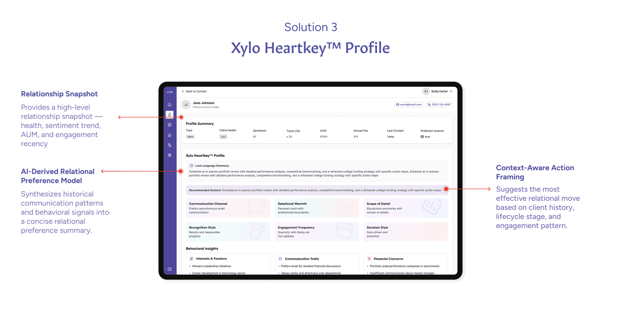
I added a "Why this draft" section — collapsed by default, but always available — so advisors can verify the AI's reasoning before sending. Each draft is grounded in the client's DISC profile and recent interaction history.
Version history was replaced with left/right arrow navigation directly above the draft. No participant in testing found the original hidden link. The new navigation shows draft content immediately — advisors see what changed before deciding to restore.
The Calendly link was moved out of the draft body entirely. It now lives as a persistent layer that survives every AI regeneration, because it's a user choice, not AI-generated content.
Finally, a channel switcher — Email, Phone, Zoom — lets the AI generate content appropriate to the outreach method. A phone call gets a talk track; a Zoom meeting gets an agenda with an invite preview.
Project Task 02
Redesigning the data dashboard experience into a relationship monitoring engine

Problems
The Dashboard Functioned as a Data Summary — Not a Decision Tool
The previous version of the Xylo Dashboard was designed as a summarized view of the existing CRM system. It consolidated metrics such as AUM, health scores, sentiment, fees, referral warmth, and contact history into a comprehensive table. While information was centralized, it did not translate into clarity.
The table contained too many static data points, requiring advisors to manually scan and interpret signals across multiple columns. Important changes, such as sentiment drops or engagement gaps were visually subtle and easy to miss.

Approach
Interviews and usability testing to identify true decision drivers and eliminate non-essential signals
To redesign the dashboard effectively, I first focused on understanding what actually drives advisors’ decisions rather than assuming which data points were important
I also conducted usability testing to validate the new prioritization logic

Design Decision
Prioritization by Change, Not by Status
I redesigned the dashboard to prioritize change-based signals rather than static summaries. Sentiment became “Sentiment ↓18% (7d)” instead of “87 (-18%).” Inactivity became a time-triggered alert. Risk states became visible clusters instead of subtle indicators.
However, surfacing change alone was not enough and signals needed to translate into action.
The original “Top Actions” module grouped alerts by category (Churn Risk, Opportunity, etc.), requiring advisors to interpret urgency themselves. I redesigned it around decision context instead of system taxonomy.
Each action now clearly answers: Who needs attention, Why now and How to act.
By adding explicit triggers (“47 days silence”) and suggested channels, the interface shifts from displaying alerts to guiding next steps by reducing ambiguity and accelerating decision-making.

Project Task 03
Evaluating the Personalized Relationship Intelligence
Problems
Fragmented relationship insight disrupting advisor workflow
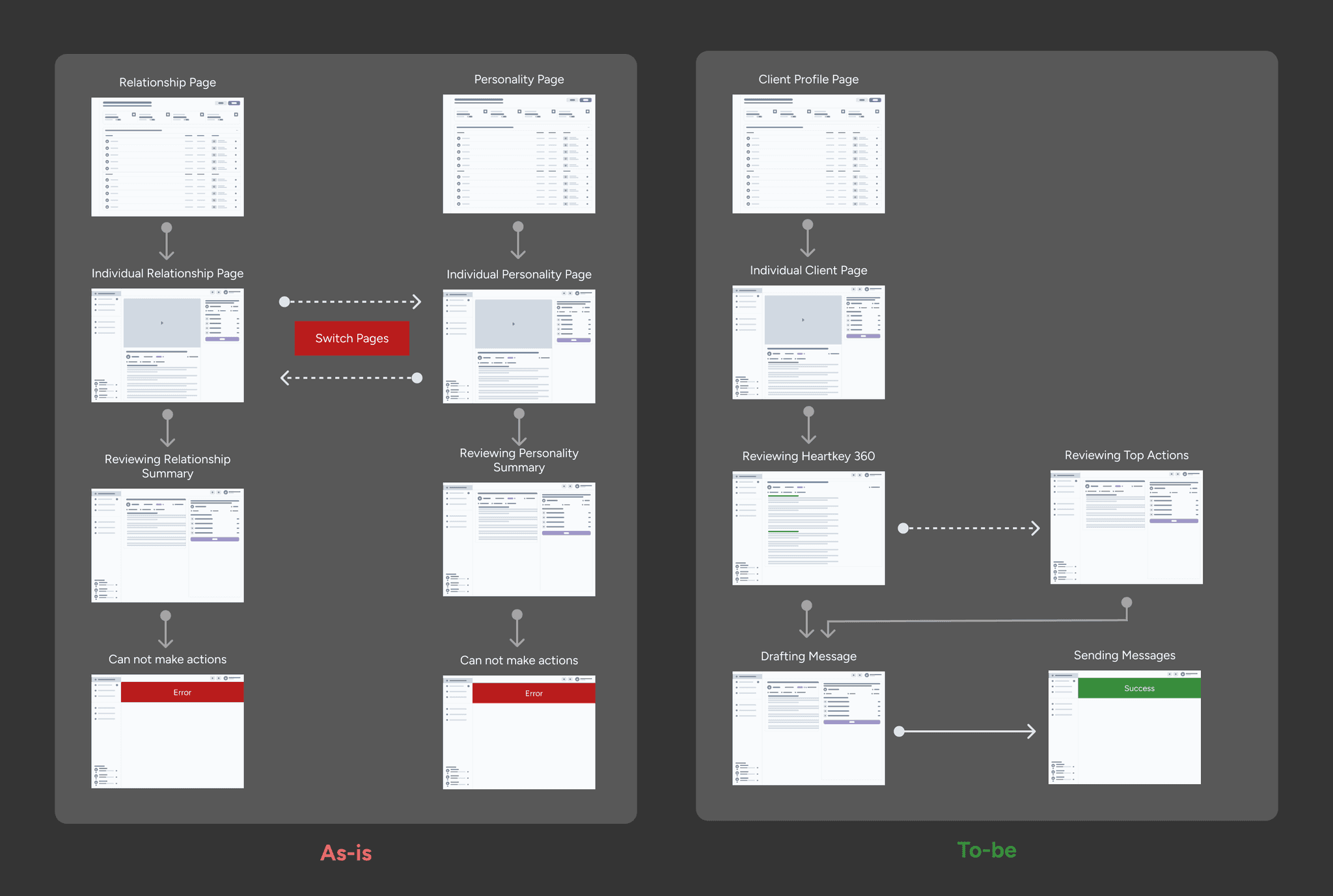
The previous version of the Xylo dashboard separated Relationship and Personality into two independent pages. Advisors were required to review relationship context on one screen, then switch to another page to interpret communication style and behavioral traits.
Although the data existed within the system, it was not structurally connected. This separation introduced unnecessary context switching, increased cognitive load, and slowed down decision-making.
As a result, personalized communication relied heavily on manual interpretation rather than guided intelligence, limiting scalability and consistency across advisors.
Approach
Introducing HeartKey 360 to unify insight and action
To streamline the workflow and reduce friction, I introduced concept "HeartKey 360", a unified relationship intelligence layer powered by Xylo AI.
Instead of separating who the client is from how to engage them, HeartKey 360 consolidates behavioral signals, sentiment trends, and communication patterns into a single decision surface.
Through AI analysis, the system generates a structured communication strategy and provides recommended actions directly within the same view.

Design Decision
Reframing Relationship Insight as an Action-Oriented System
Rather than refining two separate pages, we made a structural decision to redesign the experience around a unified client profile.
The previous architecture treated relationship data and personality traits as parallel information layers. While both were valuable, they required advisors to manually connect context before taking action.
We consolidated these layers into a single Client Profile Page, anchored by the HeartKey 360 model. This allowed insight, interpretation, and action to exist within one continuous flow.
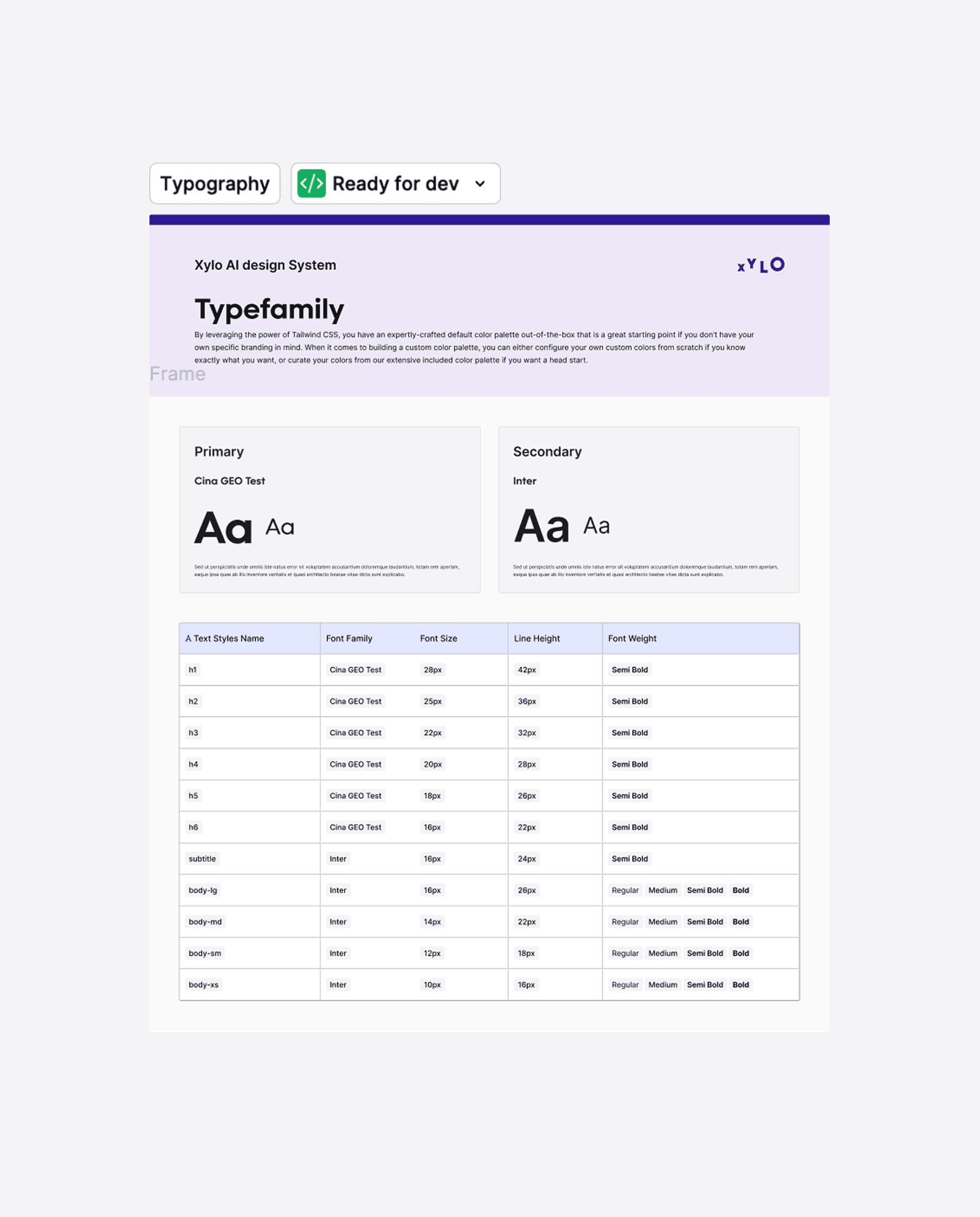
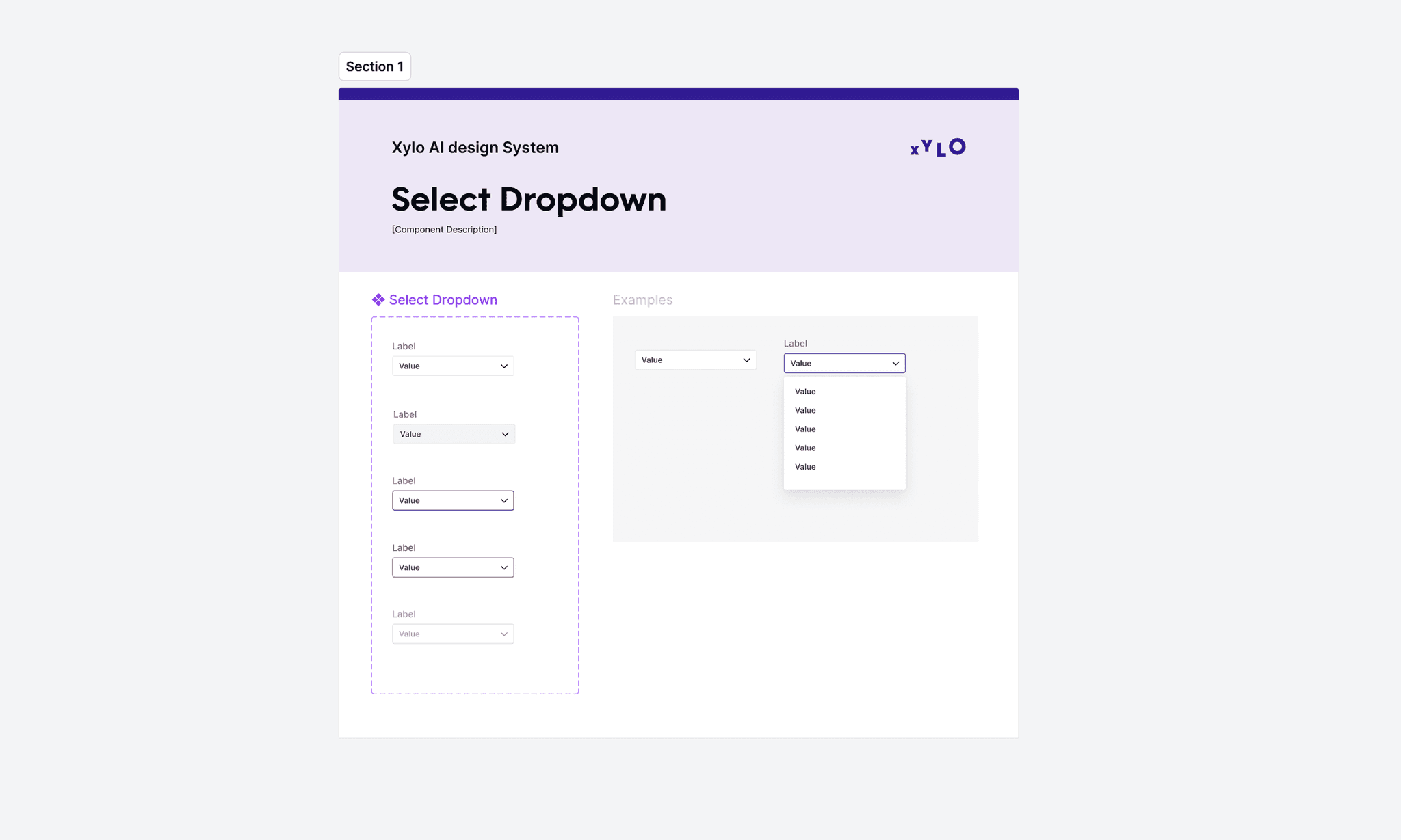
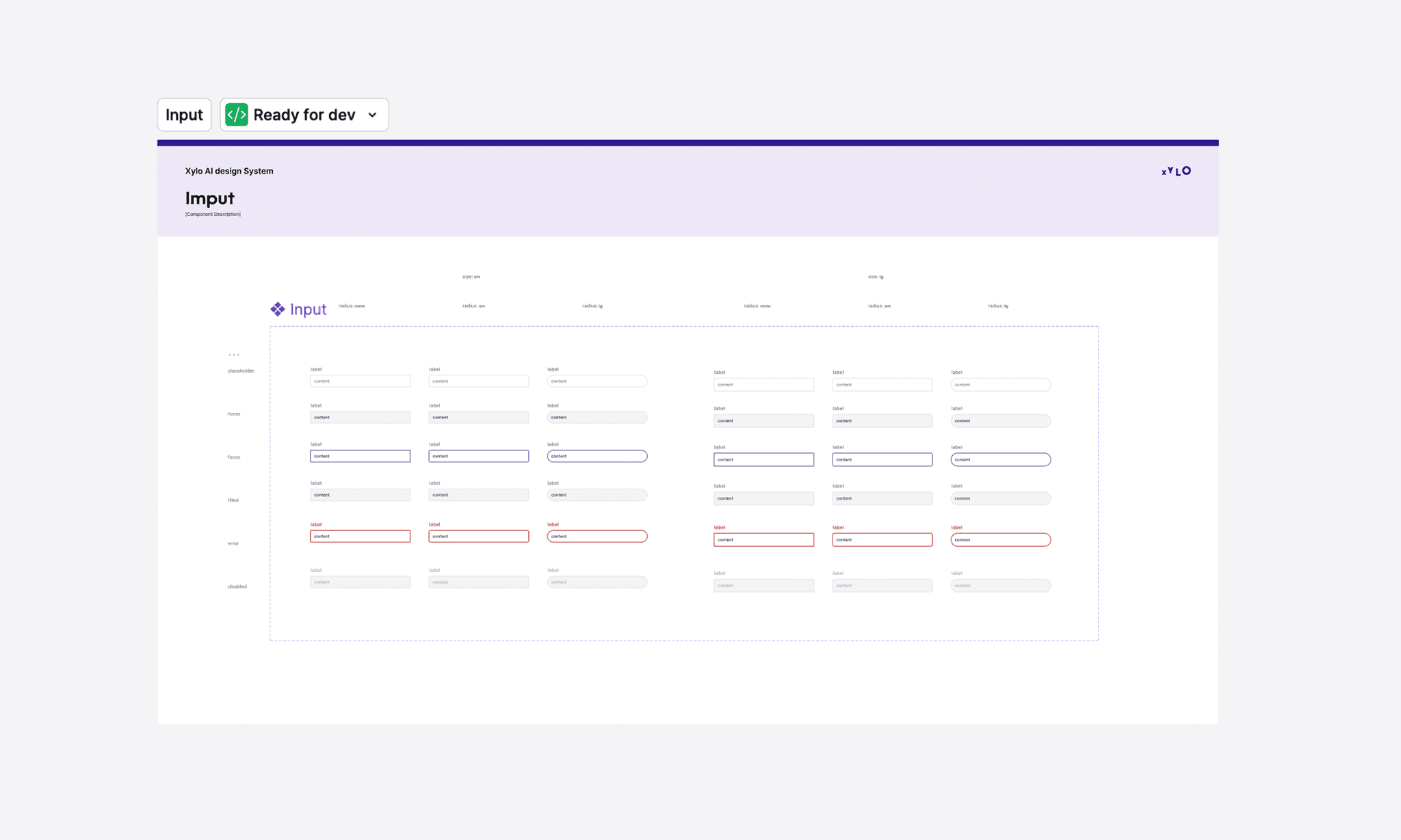
Design System
Building a Scalable Identity While Aligning Design + Engineering
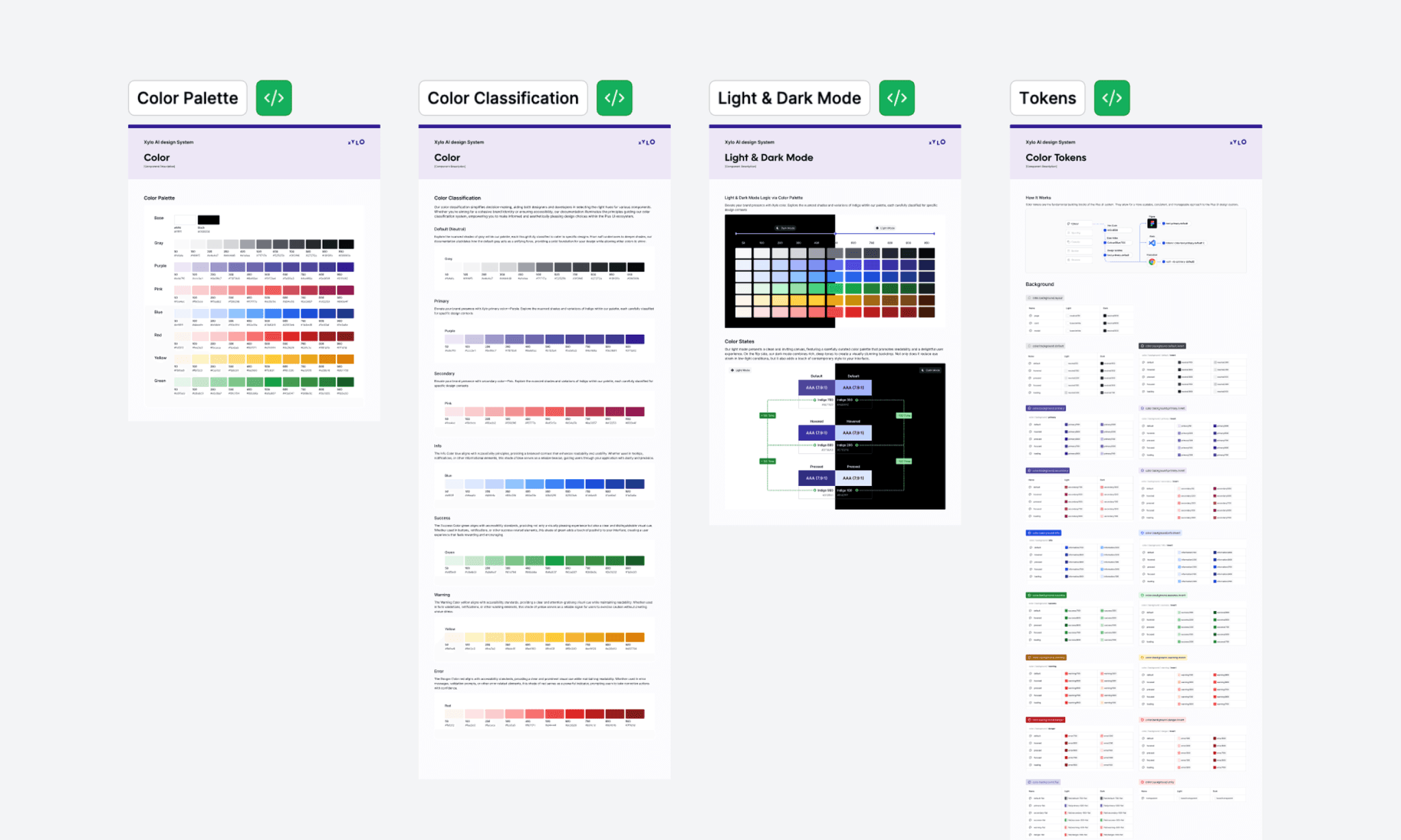
When I began this project, the product was already built using Google Material Design. While functional, the interface lacked Xylo branding and personality. The system felt generic and did not reflect the intelligence-driven positioning of the platform.
As a summer intern, rebuilding a design system from scratch was not feasible within the project timeline. Instead of starting over, I explored how we could introduce brand differentiation while maintaining engineering efficiency. After discussions with the front-end team, we decided to adopt Hero UI as a flexible foundation.
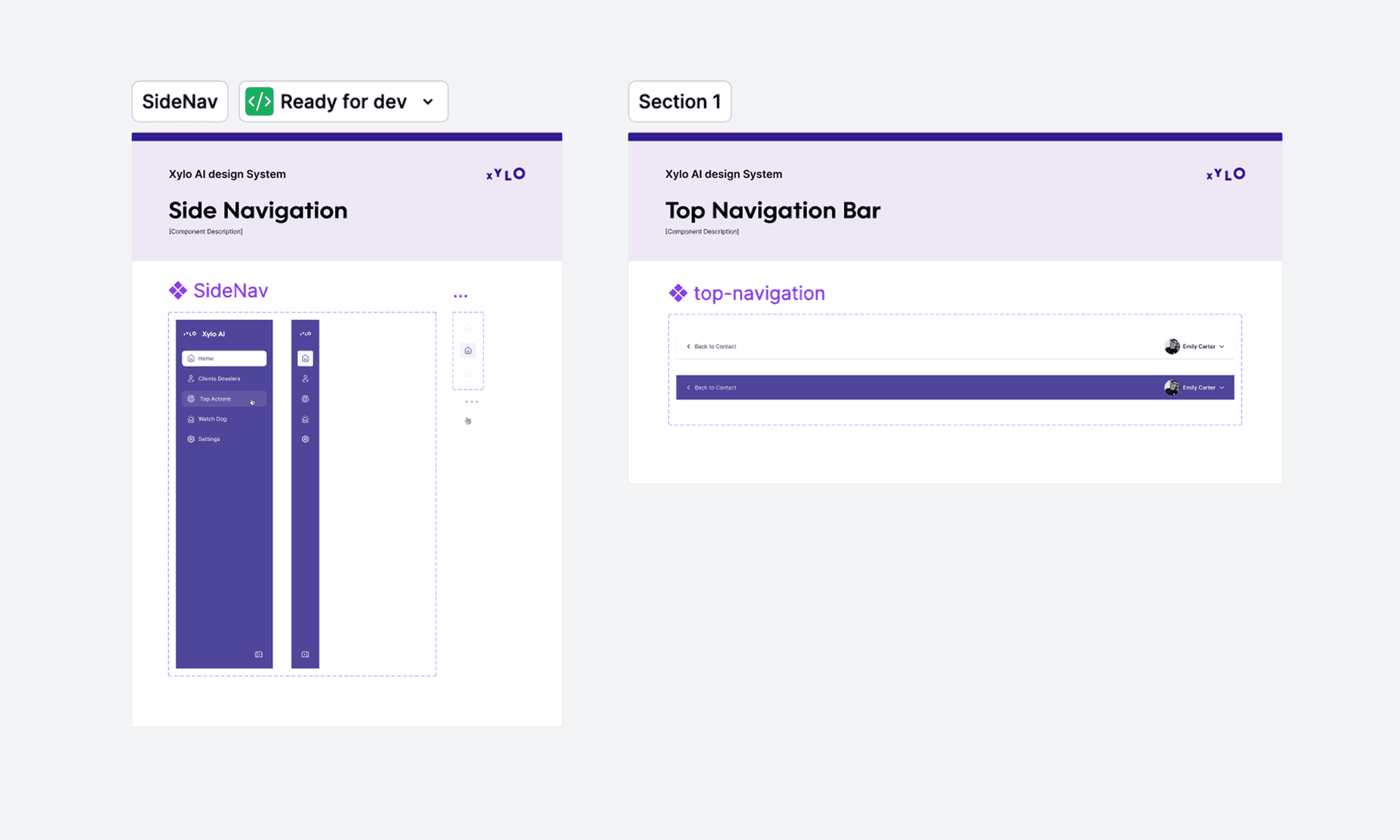
From there, I established new color tokens, typography hierarchy, and component variations aligned with Xylo’s brand direction, while ensuring seamless integration with development workflows.
Impact
Success Metrics & Results
After four months of cross-functional collaboration, we successfully launched the Xylo MVP. The redesign increased advisor workflow efficiency by 20% by reducing decision hesitation and manual signal analysis.
Beyond usability gains, the MVP attracted interest from 50+ financial advisors and supported the company in securing $10M in funding, reinforcing Xylo’s positioning as a relationship intelligence platform rather than a traditional CRM dashboard.
"This project reinforced one conviction: the best design doesn't show more — it helps people decide faster."

Design is constrained by systems, not just screens
Effective solutions depend on backend capabilities and data structure
Early alignment with engineering is critical to avoid rework

Driving adoption is as important as designing the solution
Reducing adoption friction is key to implementation
Demonstrating value is more effective than enforcing standards

Consistency requires cross-functional alignment, not just design rules
Without a shared system, implementation becomes fragmented
Design systems succeed through adoption, not enforcement

